That being said, there is ONE thing that I notice [no matter how much I try not to] when I'm in any place. This one thing is a personal pet peeve, and one of the few Design Sins.*
*A word about sins: There are only a handful major 'sins' in design. These usually have to do with space planning and safety code adherence. In decorating, however, there are a few more sins and they're frequently changing with trends, fashion, etc. To that end, I'm not one for WRONG vs. RIGHT. A little decorating sin is not the end of the world and no one deserves a big red X slashed across a snapshot of their home. So, I choose to work with the phraseology of "Unfortunate" vs. "Better." An unfortunate decision about home decor is subjective and I am not one to throw invisible Rule Books at anyone.
As I was saying, of all the "unfortunate" sins, there is only 1 that will send me into a mental tizzy when I cast my eyes upon it. Even if I'm a guest in your home and I'm not hired to be judging the home, I can't help myself with this one issue.
This sin is.... Your wall art. You hang it too high. And you often hang it poorly so it's CROOKED. I've been caught more than once leveling our a frame while standing near a wall during a cocktail party. OCD much? You betcha.
The TOO HIGH ART PLACEMENT is not something that I can sneakily fix while enjoying your cocktail party, tho. It's a problem that can be avoided/fixed, though, with a few simple rules and very handy tools.
  |
| Your art is begging you to stop hanging it too high! Purple shirt is making an 'unfortunate' mistake! |
The confusing suggestion for many people is that "you should hang your art at Eye Level." Whose eye level, though? For example, I'm a shorty and my eye level is much lower than my tall husband. The standard blanket-statement guideline is to hang your art at 57" on center from the floor. Keep reading for more on this...
| A 'Rules of Thumb' page with hanging level diagram that I included with a an e-decorating presentation. |
There are plenty of online sources to explain the best/better/'only' way to hang your art (try here, here and here though that last one is a little contrived and complicated in its rules-yness so pls take it with a grain of salt). But when I saw the handy-dandy photoshopping skills of fellow blogger Mojan below, I saved the post and her clever comparison photos because it was a very simple and straight-forward visual presentation of the too-high conundrum.
 |
| UNFORTUNATE: If this looks perfectly fine to you, please keep reading. |
 |
| BETTER: This is the original image from Lonny that Mojan tweaked above, See how the painting's placement is closer to the sofa, creating a stronger sense of composition and balance? In fact, the room seems larger and airier with the proper art placement. |
 |
| Unfortunate. |
 |
| Better. image via Pinterest |
 |
| Unfortunate vs. Better image via BothTogether |

 |
Use the 57" line to dictate the center of a gallery-style grouping. |
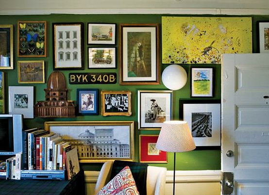
And while we're on the subject of gallery-style groupings, use your walls to their best potential by filling them a wide range of art. Combine fine heirlooms pieces with thrift finds and framed projects that your kids drew in school. Mix pen&ink drawings with huge photographs. Or oil paintings with vintage postcards. The mis-matchyness of a diverse art wall is what makes the gallery-style installation work so well.

 |
| Above 3 images via my Pinterest. |
 |
| My best pal on quickie installations |
*Not an endorsement for the Hang & Level tool.
So what did we learn today? That the 'unfortunate' mistakes of decorating are not deadly sins, but easy adjustments for a more refined appearance in your home. Now, unfortunate mistakes of design are a bigger problem, with steeper consequences. Perhaps I'll do a post on design sins soon!
Cheers,
Whitney
2 comments:
Wow, this was a great lesson today. I feel like I took a class in 5 minutes of reading. I'm a shorty too, and I hate to see art having been hung at some 6'2" person's eye level. My sins are minor....
I agree, hanging artwork at an appropriate height can make a big difference.
Post a Comment