When I was in design school at the New York School, I took a terribly difficult lighting class that challenged my embarrassingly basic mathematics, physics and chemistry knowledge. Through the semester, I learned so much about the science of light, about color temperature, kelvins and electric wattage. But perhaps most importantly, I learned about the importance of lighting placement. Yes, we all know that lighting is more than the basic builder's-grade flushmount popped into the ceiling of a hallway or kitchen. It's about creating zones of light: Overhead, Task and Ambient.
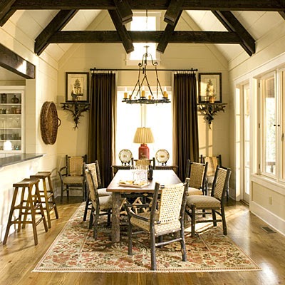
In a project for that Lighting class, I designed a magnificent beam ceiling for a private club of a racetrack. The room was to resemble the interior of an equine barn, and so I used an open-truss ceiling, with the beams of the structure fully exposed in their structural glory. As it was a lighting class, I devised a system so that the room's overhead lighting would be built into the beams. Man, I love wood beams...
I am always drawn to a good crewel. Crewel embroidery is a surface stitch, usually with wool yarns on a hearty base material, like cotton or sturdy linen. The needlework technique is at least a thousand years old. And, it rocks my socks off.
Chairs upholstered in a regal Jacobean crewel by Suzanne Kasler via Traditional Home via tartanscot
Some intricate crewel-ty. Get it?!?! Crewel-ty!?!?!
Hamish Bowles' New York and Paris apartments have been gushed over for quite some time on the blogsphere, and for good reason! These images of his homes in NYC and Paris provide loads of inspiration. The free use of colorful fabrics, antique artwork, unusual lighting pieces, tailored furniture and well-curated accessories is wonderfully stimulating. Recently, I've been freelancing with an architecture firm whose work is deliberately restrained with very quiet décor. Revelling in these images of Bowles' homes today feels like a happy punch in the face to quiet décor!
via Vogue
via Vogue
via World of Interiors
via World of Interiors
via World of Interiors
via World of Interiors
via World of Interiors
Hamish Bowles, European Editor at Large for Vogue. Isn't he dapper?
I am often asked if I judge others' homes immediately upon entering. "Of course not," I balk. "Does an optometrist judge every set of eyeballs he meets? Nope. Only the ones who are paying him to do so." Comparing myself to an Optometrist is absurd, and I know it.
That being said, there is ONE thing that I notice [no matter how much I try not to] when I'm in any place. This one thing is a personal pet peeve, and one of the few Design Sins.*
*A word about sins: There are only a handful major 'sins' in design. These usually have to do with space planning and safety code adherence. In decorating, however, there are a few more sins and they're frequently changing with trends, fashion, etc. To that end, I'm not one for WRONG vs. RIGHT. A little decorating sin is not the end of the world and no one deserves a big red X slashed across a snapshot of their home. So, I choose to work with the phraseology of "Unfortunate" vs. "Better." An unfortunate decision about home decor is subjective and I am not one to throw invisible Rule Books at anyone.
As I was saying, of all the "unfortunate" sins, there is only 1 that will send me into a mental tizzy when I cast my eyes upon it. Even if I'm a guest in your home and I'm not hired to be judging the home, I can't help myself with this one issue.
This sin is.... Your wall art. You hang it too high. And you often hang it poorly so it's CROOKED. I've been caught more than once leveling our a frame while standing near a wall during a cocktail party. OCD much? You betcha.
The TOO HIGH ART PLACEMENT is not something that I can sneakily fix while enjoying your cocktail party, tho. It's a problem that can be avoided/fixed, though, with a few simple rules and very handy tools.
Your art is begging you to stop hanging it too high! Purple shirt is making an 'unfortunate' mistake!
The confusing suggestion for many people is that "you should hang your art at Eye Level." Whose eye level, though? For example, I'm a shorty and my eye level is much lower than my tall husband. The standard blanket-statement guideline is to hang your art at 57" on center from the floor. Keep reading for more on this...
A 'Rules of Thumb' page with hanging level diagram that I included with a an e-decorating presentation.
In the museum and gallery industry, pieces are hung at this 57" line (though I've spoken with a few people who claim its 56"). So if the world's finest art is being hung at an 'eye level' of 57", isn't it fair to say that this standard is something by which we should/could all abide?
There are plenty of online sources to explain the best/better/'only' way to hang your art (try here, here and here though that last one is a little contrived and complicated in its rules-yness so pls take it with a grain of salt). But when I saw the handy-dandy photoshopping skills of fellow blogger Mojan below, I saved the post and her clever comparison photos because it was a very simple and straight-forward visual presentation of the too-high conundrum.
UNFORTUNATE: If this looks perfectly fine to you, please keep reading.
Wall-hung artwork should relate to what's happening in the room. In the room above, a beautiful New Orleans home, the art is floating in a sea of pale wall. The painting seems to be hovering over the room, not accompanying the furniture and decor. The placement is, in fact, doing a huge injustice to this stunning painting, and to the entire room.
BETTER: This is the original image from Lonny that Mojan tweaked above, See how the painting's placement is closer to the sofa, creating a stronger sense of composition and balance? In fact, the room seems larger and airier with the proper art placement.
Use the 57" line to dictate the center of a gallery-style grouping.
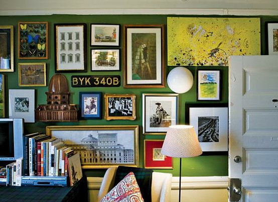
And while we're on the subject of gallery-style groupings, use your walls to their best potential by filling them a wide range of art. Combine fine heirlooms pieces with thrift finds and framed projects that your kids drew in school. Mix pen&ink drawings with huge photographs. Or oil paintings with vintage postcards. The mis-matchyness of a diverse art wall is what makes the gallery-style installation work so well.
I use a very handy little tool called the Hang & Level* when hanging art. I find my 57" line, tape up a little Frog Tape to mark it, and go from there. The Hang & Level helps me make the right marks on the wall before we start impulsively banging holes into walls. And having the multi-level guides helps to avoid an off-center or crooked installation. Crooked art is off-putting, and can be so easily resolved. Pop a level on your frame and watch the bubble guide you to a straight line. Easy peasy!
My best pal on quickie installations
*Not an endorsement for the Hang & Level tool.
So what did we learn today? That the 'unfortunate' mistakes of decorating are not deadly sins, but easy adjustments for a more refined appearance in your home. Now, unfortunate mistakes of design are a bigger problem, with steeper consequences. Perhaps I'll do a post on design sins soon!